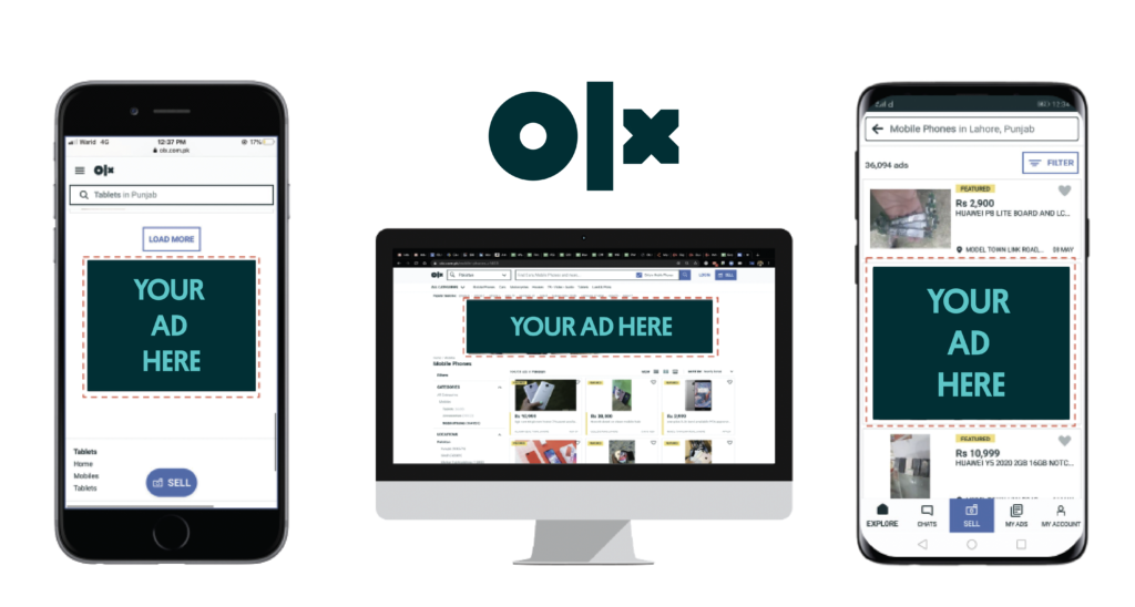
How To Make Your Self-Serve Campaign Successful
When it comes to running your campaign, you want the highest possible visibility for your advertisement so it can attract the highest possible number of people to your brand. There are a few key elements that you need to include or take a look at when creating your banner advertisement. The more effective your advertisement is, the more successful it will be in achieving your goal whether it is to generate leads, increase traffic, or get people to sign on to your service.
What Makes An Ad Successful
Brand Recall: your advertisement should feature something (whether it is a visual element or text) that is catchy so the viewer will remember it instantly
Clear Communication: Your message should be communicated with clarity and the viewer should not feel confused or overwhelmed
Balance: The visual and textual elements need to be balanced so as to not become confusing or clustered as that would lead the viewer to lose interest
How To Come Up With A Successful Banner Ad
When making your banner, the first step is to brainstorm. This is the first and most crucial step as it helps you decide on a look and feel for your advertisement. Ideally, your goal is to reflect the look and feel of your business in your advertisement so your audience can gauge what your business is all about at a glance.
Some key things to think about at this stage are:
- What is my brand philosophy?
Your brand philosophy is the set of values, code of conduct, ethics, and culture that make up your brand. This includes your tone of voice. For example, a company like Johnny and Jugnu has a very interactive and friendly tone of voice. Their media content is, therefore, very interactive, colourful, and playful. Your brand philosophy should reflect in any communication you have with your audience including advertisement banners.
- What is the purpose of my ad?
Here you may want to figure out whether your ad is meant to create general awareness of your brand, advertise a new product, or contribute to a cause you may find important.
- What reaction do I want to incite?
It is important to think not just as the advertiser but also as the customer. You would want to create content that is getting the right kind of attention and for that it is important to figure out whether what you want the audience’s attention to be grabbed via deep and emotional content, humorous and light-hearted content, addictive jingles that increase brand recall, or communicate a somber message in a direct manner.
- What is the best way to get my message across?
At this point you will begin to flesh out your concept in terms of colours, text, placement, etc. You will figure out whether a photograph, simple text, illustration, or a mixture of all would deliver your message most effectively. This will play a major role in informing the final look of your banner advertisement.
- What is my competition doing?
While it is important to stay true to our own tone of voice and idea, it is also beneficial to see what your competitors are doing in order to gain insight, inspiration, or simply to gauge how well your advertisement might perform against theirs.
Visual Elements Your Ad Should Have
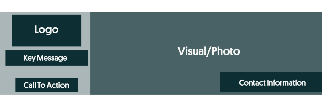
- Logo: It is important for your brand to have a logo that describes what you do. This is necessary as it is what people will remember you by.
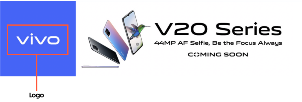
2. Key Message: Your ad should be clear about what you want to communicate to your audience whether it is an awareness campaign or a product/service you are selling

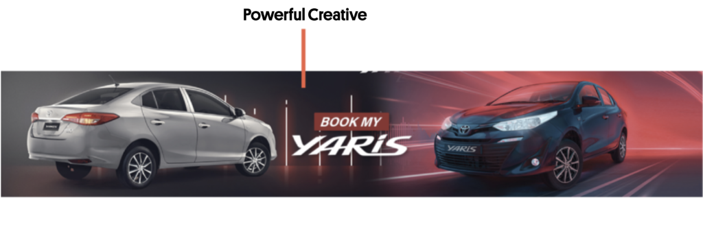
3. Creatives: A clear, high-resolution image adds value to your advertisement and increases the chances of people looking at it and taking interest in it.
4. CTA: The Call To Action button is what tells people how you want to interact with their advertisement. For example, if you want people to see your advertisement and go onto the catalog page of your website, your CTA could say “See More”. This makes it easy for the audience to access your website/page, etc.
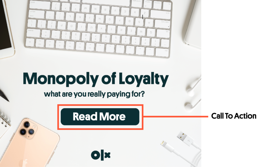
Sample Banner Template
Some More Guidelines
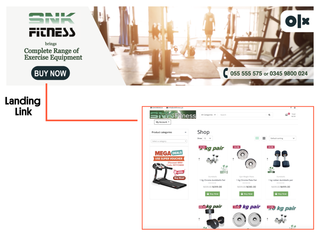
- Landing Link: It is of utmost importance for you to provide a landing link to your website, Facebook page, Instagram page, etc., as your advertisement cannot be posted without it. A landing link provides a platform for an interested user to be redirected to once they see your advertisement and click on it.
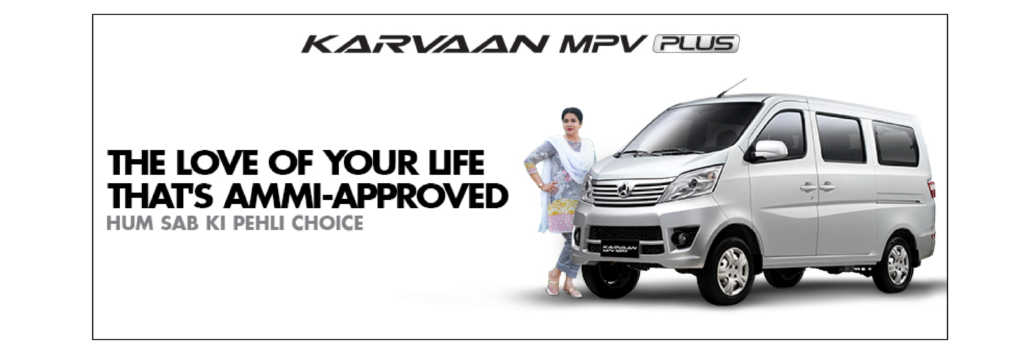
- Target Information: If your product/service applies to a specific kind of audience, your advertisement should be clear in communicating that. For example, try to look for south-Asians people to feature in any visuals for ads running in Pakistan.

- Contact Information: You should ideally provide a phone number or email address for the audience to reach out to you if they are interested in your campaign or have queries and want to find out more.
What Should Your Ad NOT Have

- Cluttered Text
The most important chunk of text should be more readable, therefore, bigger in size and placed in a way that the eye sees them first. There should be as little text as possible; try to say more in less.
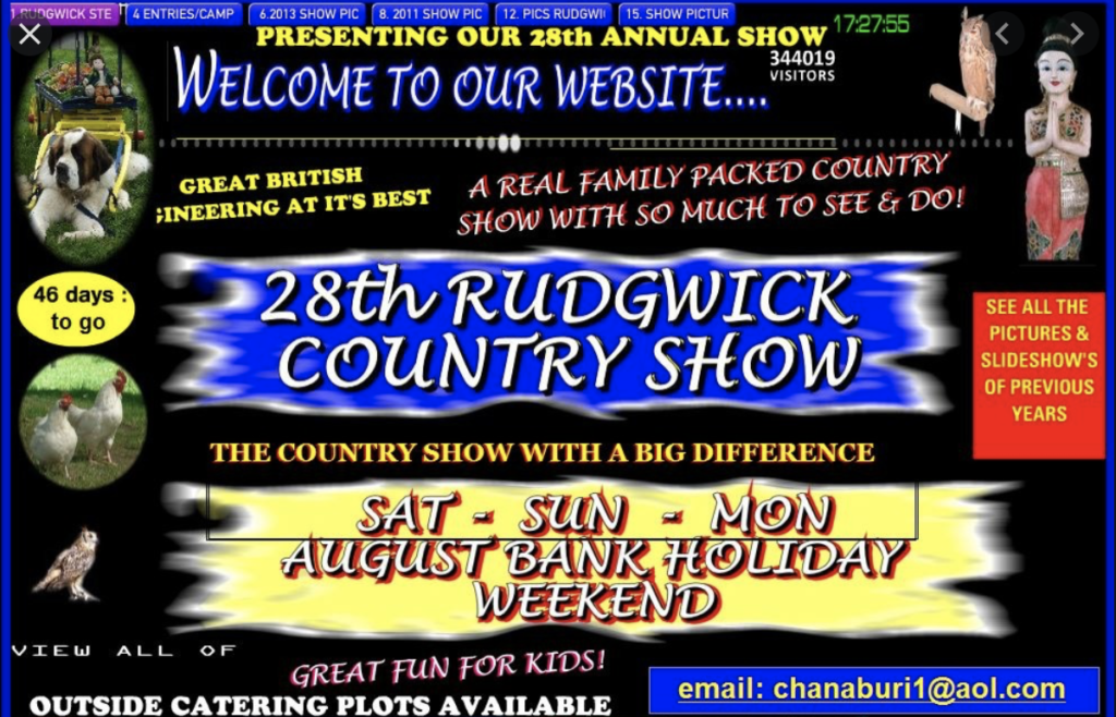
- Too Many Typefaces
You must stick to 1 or 2 (at most) typefaces when putting text on your banner advertisement. Too many different typefaces, again, adds to the visual clutter and makes the advertisement look unprofessional and uninteresting.

- Too Many Colours
Your colour palette should reflect your brand identity or the branding scheme you have for that particular campaign. Too many colours make your banner look haphazard and, therefore, unattractive.
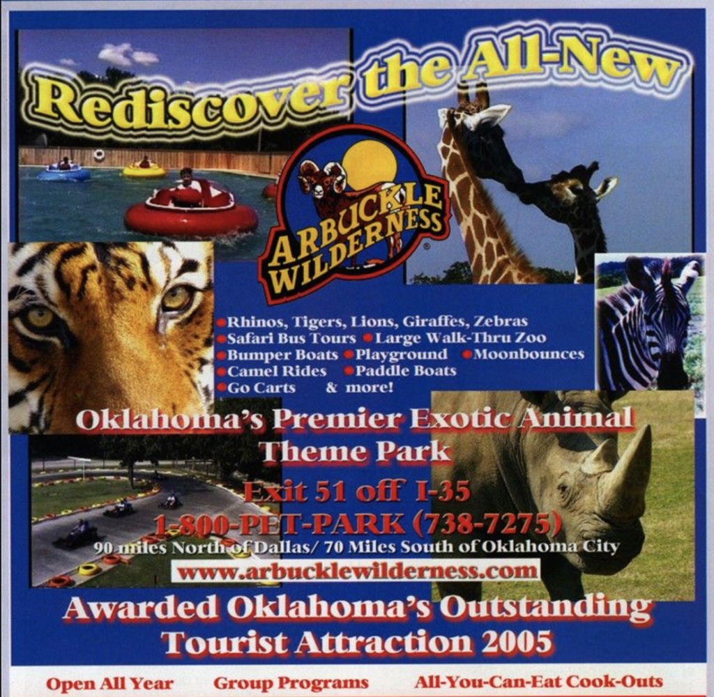
- Too Many Pictures
For visual harmony, it is important to choose only 1-2 good visuals and make sure their color, content, and placement is such that it does not create a visual mess.
Looking to read up on more interesting topics from what’s happening in autos to what’s the latest in mobile and electronics?
For more information visit OLX to find a wide range of products and services and choose the one that best suits your preferences and budget. With thousands of ads posted daily, OLX is the smarter choice.



Leave a Reply